
Identity
Cut through the noise
Your mark or “brand” says to the world, ‘Here I am’. If the worlds says, ‘Tell me more’, we’ve done our job.

CROCUS TECHNOLOGY 
Electro-magnetic forces are the basis behind the Crocus’s intelligent sensors. The logo is a marriage of a Crocus flower and a representation of electromagnetic path between the poles, north and south.
 Original Version
BOOMERANG BIKE 
MDG advised the client to change the name of their gps bike tracker from WI-MM to something consumers could relate to. We gave the client a list of choices and decided on Boomerang Bike – Your bike will come back even if the bike was stolen. We also trademarked the name through the USPTO.

PRODUCT ARCHITEX 
This design company excels in product design and development. The company adds aesthetics that communicate not only the product’s intent, but also how to users interface with the product. Their logo was designed to add more than 2D dimensionality and suggests going beyond expected solutions.
 Original Version

THE AVID PIANO TECH
Peter Acronico is a world-class piano techician woking with international concert pianists. We wanted to make the mark a personal one as Peter’s reputation is sought after due to his talented ears and expertise.


CB TECH 
This company is a hub for facilities management enterprise serving the largest corporations in the country. They offer everything from records management, security, document destruction to janitorial. The mark communicates many connections under one provider.
 Original Version

SEARCHROCKIT SEARCH ENGINE
SearchRockit is a privacy search engine with a billions of unique URL’s added beyond big tech’s data to make browsing faster and wider. We developed the brand name as well as the look and feel of the mark. The logo is playful and bold, but pushes the concept of exploration.


EARLY RESOLUTION TEAM 
This logo was designed for a medical consulting firm working with hospitals,’ doctors and nurses to minimize the time and expense needed to resolve common patient care issues. We used the ‘cutting through the maze’ themes throughout various medias to bring home the speed of their process.

NURSING TOOLS 
The Nursing Tools brand needed an update to soften the dated and hard edge feelof their logo. In addition, it’s no secret the vast majority of nurses are female and products with pink sold the most. The new branding has been a success with positive feedback and increased sales.
 Original Version

VIRTUOSO MOTORS 
The logo is for a line of cars designed after some of the world’s most popular sports cars in the world, including vintage models from the 50’s, 60’s and 70’s. The mark carries a strong retro look and feel associated with quality sports cars of the past.


IMAGESCAN 
We designed this logo for a medical records imaging company. The mark represents the thosands of records scanned and saved. The offset double flower image is formed with scanned pages in a forced perspective spiral. The two colors combine to create the illusion of after images when looking at scanned light source.

DOCUCENTS 
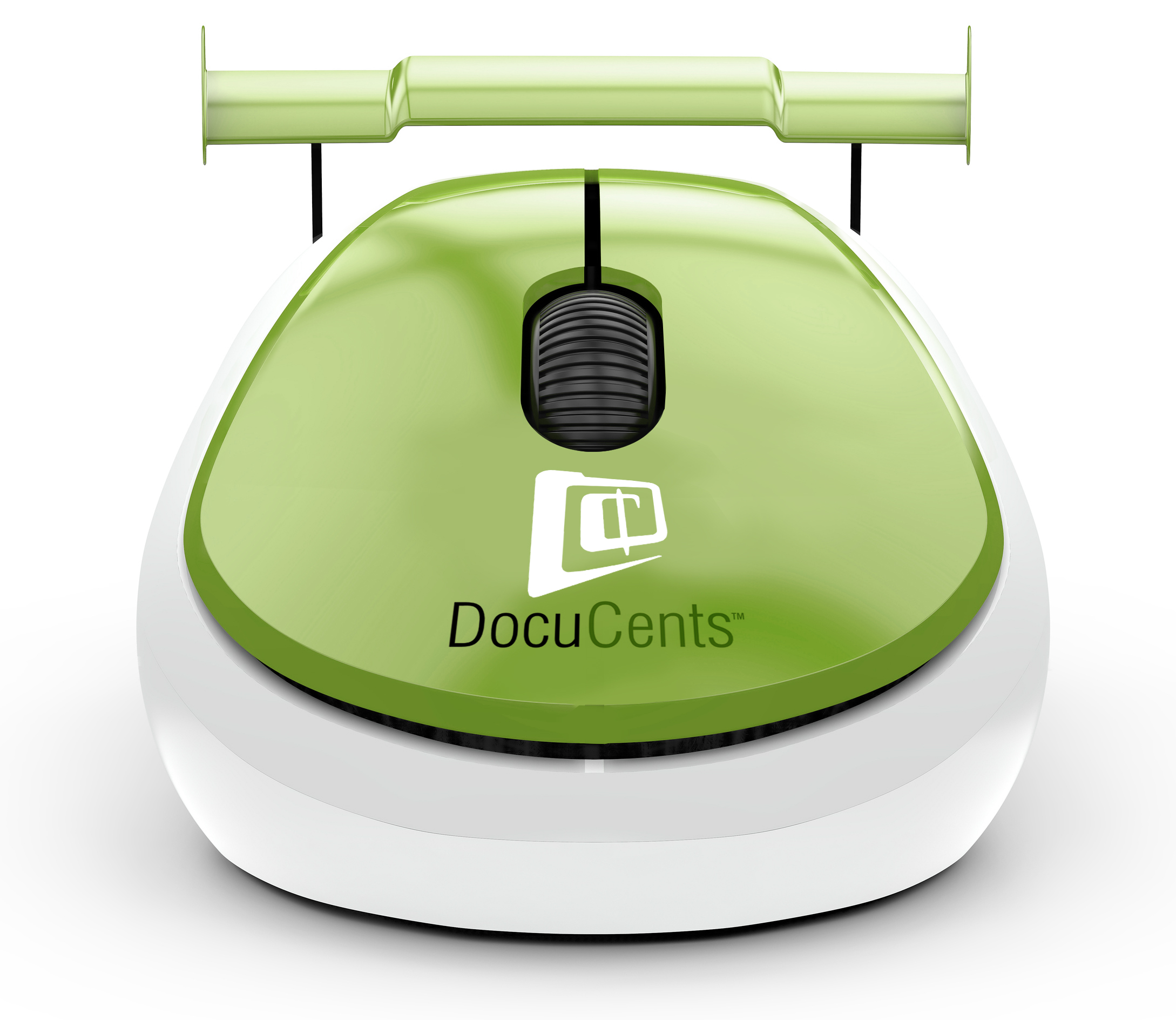
This client is a legal records scanning and document management company. Their efficiencies and speed compared to the competition part of the logo needed to convey price advantage, thus the inclusion of the cents symbol.

SHARP PARK REALTY
This real estate office is in one of the most beautiful areas of California known for its oceanscapes and beachfront properties. We wanted to make the Monterey Pine trees integral to the logo.


 EARLY COMMERCIAL
SERVICES
We designed this logo for a general construction services company. It worked well across all media including wraps and apparel with its simple but immediately recognizable shapes.


 METAL TREATING
INSTITUTE
MDG was approached by the MTI to come up with a creative approach for a mark that symbolically shows both the extreme heating and cooling of metal treating. The logo incorporates a metal background as a backdrop to form a dynamic globe showing the extremes of metal treating.
SYSOREX INSTITUTE 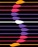
The original mark for the institute was like many others at the time – just the name using a futuristic font. However, the institute was a pioneer in the development of digital analytics particularly in the world of professional sports. The bright white node stands out apart from others.
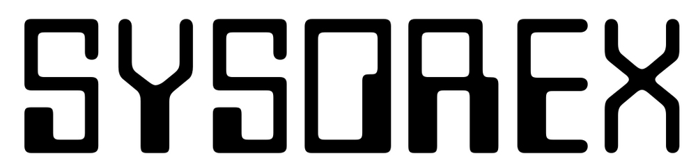 Original Version